Illustrating the Advent Calendar with Nïma Nïma Studio
This year we’ve collaborated with Nik from Nïma Nïma Studio to create Advent Calendars that are every jewelry lover’s dream, with mystic illustrations to match the cosmically curated jewelry inside. Keep reading to find out more about our Advent Calendars, and Nik’s cosmic design process…
single_upsell
What inspired your illustrations?
My work is predominantly influenced by nature and celestial objects. I love building up a scene which offers a calming balance through symmetry, often complimented with wavy shapes to lead the eye centrally to either a Sun or Moon. I also love a low horizon line - so there’s a big section of sky allowing the illustration to breathe. Once I have these basic elements, I draw other elements around this. At the moment I’m very inspired by the form of clouds, checkerboard patterns and Mediterranean architecture, especially columns - so as soon as I saw the initial archway shape of the 12 Day Advent Calendar I instantly knew I wanted the archway shape to be a key feature of the scene. My vision from the beginning was for the calendar to be a window looking out at the night sky scene.
quote1
double1
Can you tell us a little about your design process?
I always begin with a variety of rough thumbnail sketches, exploring different elements and composition. This helps me to see what works and what doesn’t, combining all the best parts together, to build up a rough scene. I like redrawing the illustration on another layer, almost tracing the rough drawing below to get the composition and shapes more refined - for the 12 Day Calendar I must have redrawn it 40 times (I think it’s worth the time after seeing the final result!). From there, I begin to add colour to bring the illustration to life. In this case, I thought having a blue night sky really made the golden elements pop, while the peach arched border and architectural elements gave a nice complimentary warmth, tying the entire box together.
How did the designs change from sketch to final illustration?
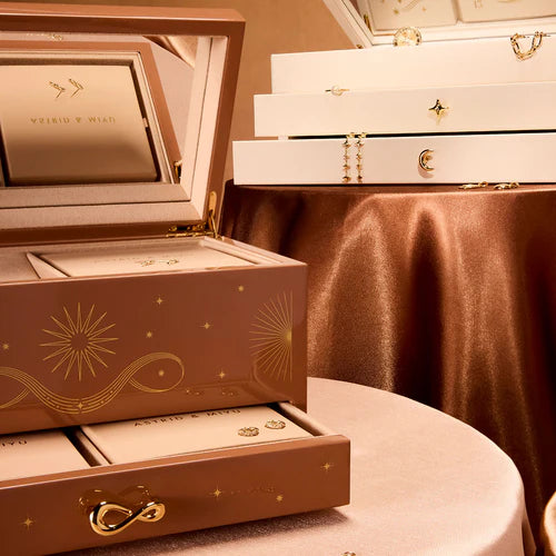
Funnily enough, the core elements from the initial sketch ideas made it through all of the design development. For the 24 Day and Solid Gold advent boxes, we stripped back a lot of the concept sketches, my initial drawings were quite intricate with a lot of linework - but we felt that simplifying the illustration made the box feel more premium, sophisticated and subtle.
quote2
How do you use the designs of our jewellery to influence your illustrations?
I looked at a lot of A&M’s jewelry to inspire the stars and twinkles, which not only keeps the illustration on brand but also fits with my illustration style perfectly. A lot of zodiac, celestial and infinity elements from A&M’s jewelry inspired the 24 Day and Solid Gold advent calendar designs. They’re very sophisticated pieces, so they were perfect starting points for these boxes.
quote3
double2
How is A&M's cosmic influence illustrated in your designs?
I feel like A&M and Nïma Nïma’s aesthetic of cosmic influence aligned really well. I’ve never really explored the celestial sky to these depths, so I loved having the opportunity to really immerse myself in what elements I can draw from the night sky and celestial space, A&M’s cosmic jewelry was a great starting point to branch out from. My work relies a lot on florals, so I had to get creative so I could still implement the wavy curves that are often seen in my work. Those curves featured in the form of shooting stars, constellations and clouds, all leading the eye to the central moon. I feel all three boxes are a celebration of the cosmic influence of the night sky and Astrid & Miyu jewelry.
quote4
{{50/50Block}}

